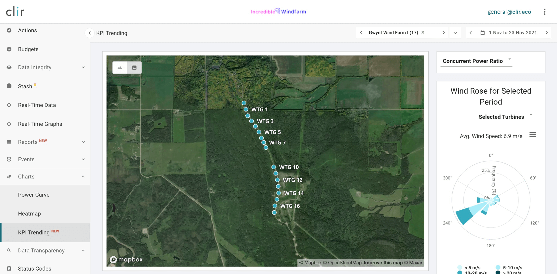
There’s a new navigation item on the Clir app — The KPI Trending tool.
The Renewable Analytics team has been using this tool behind the scenes to rapidly identify underperforming turbines. A game-changer for understanding turbines in need of deeper analysis, we’ve decided to release this functionality to our customers so they can benefit from its extensive abilities.
With KPI Trending, the self-service analytics tool empowers clients to quickly investigate individual turbine performance in relation to the other turbines on their farm. The map-view of the wind farm under analysis makes it easy to instantly compare performance and find areas of improvement.
Why use the KPI Trending tool?
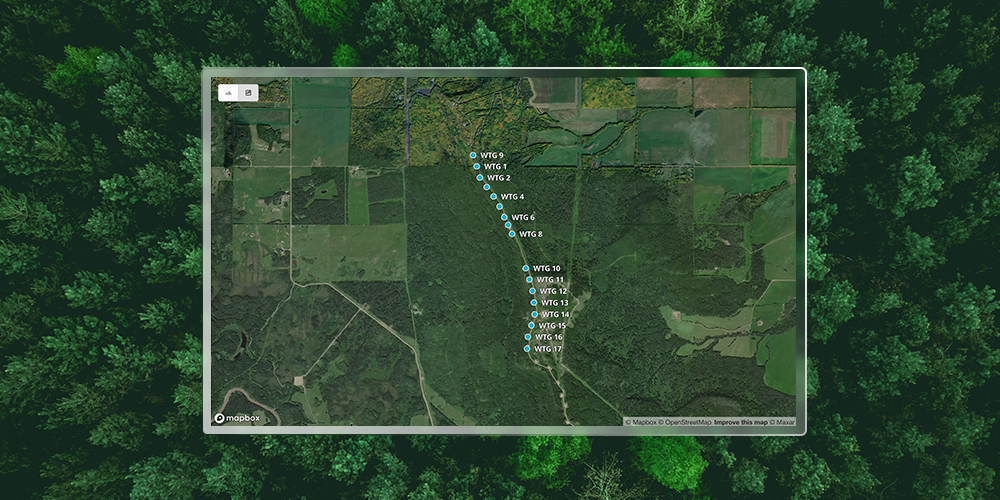
KPI Trending Page - Satellite View
Found under “Charts” on the left-hand menu, the tool compares the performance of turbines across a single farm for a selected time period. It can help answer the following questions:
- What turbines at my farm are underperforming and by how much?
- When did observed underperformance begin and how has it changed over time?
- Which turbines could be underperforming due to potential anomalous behaviour?
There are three KPI metrics available for analysis:
- Concurrent power ratio: Identifies which turbines are underperforming relative to a group of up to 20 peers.
- Historical power ratio: Identifies how the turbine is performing when compared to its historical power curve.
- Warranted power ratio: Identifies how the turbine is performing compared to its warranted power curve.
The map view allows users to see the name, location and elevation of each turbine, along with key data points related to the KPI metric selected. Users can also select which turbines to compare, specific wind directions and areas of the power curve for analysis.
Visualizing issues
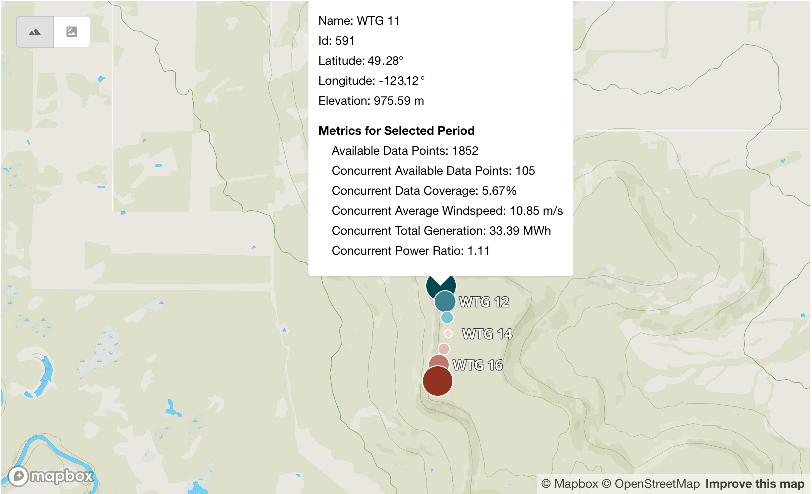
KPI Trending Page - Map View
When all input data is selected, performance is visualized in three ways:
- Map view: Helps give the users geographical context to their results by visualizing underperforming turbines as large red dots on the map. The user can hover over the dots on the map to get some contextual information to help with their investigation.
- KPI over time: A line graph showing the values of the selected KPI for the selected date range, along with the four quarters prior to the quarter.
- KPI by turbine: The same information as above, presented as a bar chart grouped by turbine.
Each visualization helps to answer different questions about turbine performance. For example, the line graph can be used to understand when the change in performance started, and if it's a historical issue or a recent trend.
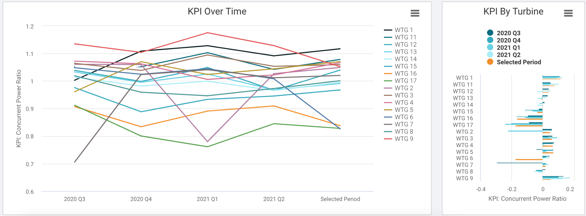
KPI Over Time View
Setting up for success
Since performance trends are easier to spot when looking at smaller groups of turbines, the tool only allows 20 turbines to be analyzed at once. Users should select turbines that:
- Are close together geographically;
- Are the same make and model;
- Are at similar elevations; and,
- Have similar surrounding geographical features, such as forestry, ridges or obstructions.
This will help reduce the impact of explainable causes of underperformance, such as environmental and resource differences among turbines. For example, it can be helpful to remove wind directions that have turbines, obstructions or ridges upwind.
To learn more about the KPI Trending tool and the Clir app, contact us.